ShopDreamUp AI ArtDreamUp
Deviation Actions

So hi, I'm Nemicrow, this weeks journal will be on Black, which is something I use in pretty much every piece. I'm sorry for this journal being late but with my French exams coming soon my schedule , and my computer has crash several times over the night.
Black is the darkest shade, and therefore has great IMPACT. When Black is by itself it's associated with:

Black is a way of instantly making a picture or character more serious, and more powerful. Black is so powerful that despite it being a shade we use it as a colour.
SIDE NOTE: when you are highlighting black always use a colour, it will make your art look more realistic and improve the mood.


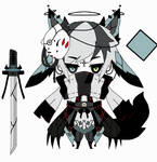
Would the woman on the left look as intimidating without the black on her uniform? Would the warm glow in the picture look quite as bright without the black? Probably not, one of the most fascinating things about black is how it compliments other colours. In fact one of the main things about black is that because it is NEVER ALONE, because it is a shade, and not actually a colour. So for this journal, we will explore some colour combos with black (Smile)")
RED & BLACK: Evil, Sin, Violence, quick movement, But also celebration, in China it's also good luck. This will make a character more barbaric than if you used blue.
 :thumb591988528:

YELLOW & BLACK: wasps, bees, if you use it wisely you can get either a sense of danger, or a sense of warmth. If you use gold, then you can have a sense of power.

BLUE & BLACK: "beaten black & blue", magic, mystery, formality. This is more powerful and formal than the black and purple.

 :thumb601092948:
VIOLET/ PINK & BLACK: mystery, magic, the Night, sophistication, sometimes, but also a wildness to.
:thumb600703262:

PASTELS & BLACK: the juxtaposition of black and pastel creates a sense of hidden power or a sense of spitefulness.
 :thumb603342260: :thumb601483220: :thumb599799799:
So that's all that for tonight folks! See you soon
Black is the darkest shade, and therefore has great IMPACT. When Black is by itself it's associated with:
Black is a way of instantly making a picture or character more serious, and more powerful. Black is so powerful that despite it being a shade we use it as a colour.
SIDE NOTE: when you are highlighting black always use a colour, it will make your art look more realistic and improve the mood.
Would the woman on the left look as intimidating without the black on her uniform? Would the warm glow in the picture look quite as bright without the black? Probably not, one of the most fascinating things about black is how it compliments other colours. In fact one of the main things about black is that because it is NEVER ALONE, because it is a shade, and not actually a colour. So for this journal, we will explore some colour combos with black
RED & BLACK: Evil, Sin, Violence, quick movement, But also celebration, in China it's also good luck. This will make a character more barbaric than if you used blue.
:thumb591988528:
YELLOW & BLACK: wasps, bees, if you use it wisely you can get either a sense of danger, or a sense of warmth. If you use gold, then you can have a sense of power.
BLUE & BLACK: "beaten black & blue", magic, mystery, formality. This is more powerful and formal than the black and purple.
:thumb601092948:VIOLET/ PINK & BLACK: mystery, magic, the Night, sophistication, sometimes, but also a wildness to.
:thumb600703262:
PASTELS & BLACK: the juxtaposition of black and pastel creates a sense of hidden power or a sense of spitefulness.
:thumb603342260: :thumb601483220: :thumb599799799:So that's all that for tonight folks! See you soon
List of All Weekly Journals
Hi, to restart the journals in 2018, I'm posting a complete list of all our journals. As some of you know, we've been using this :thumb638719959: as a list, however this should be easier to find. :heart:
Quick List of Sections:
1. Colour Theory Journals
2. 'The Colour:' Journals
3. Generalized Journals (with subsections)
4. Traditional Colouring
5. Digital Colouring
1. Colour Theory Journals
Colour Theory (Journal 15) http://cloud-of-colours.deviantart.com/journal/Weekly-Journal-15-Color-Theory-611976070
Hue, Saturation and Value http://cloud-of-colours.deviantart.com/journal/EDIT-Hue-Saturation-and-Value-Weekly-Jo
Comics, The bare bones : Weekly Journal 48
The Bare Bones of Sequential Panels.
This journal is a little like anatomy, or shading practice, it seems disjointed, but we need these parts to hold our comics together. It gives one a firm starting point, which can then be used to create something else. However, I recommend you look at other sources of information as well.
Terminology:
:bigthumb656085359:
There are a few terms I wish to clarify before I start the main part of the comic. These terms are just from https://en.m.wikipedia.org/wiki/Glossary_of_comics_terminology , though most of them come from Scott McCloud’s books. If you have the pleasure of studying a graphic
Monochromatic Color Scheme- Weekly Journal 47
Greetings everyone~ fizzypopcake (https://www.deviantart.com/fizzypopcake) ~fizzypopcake (https://www.deviantart.com/fizzypopcake) here. This marks as my very first journal entry for this group :D I hope I’ll be able instill some useful info just like how my respectable co-admins did~
:iconleafborderplz::iconleafborderplz::iconleafborderplz::iconleafborderplz::iconleafborderplz::iconleafborderplz::iconleafborderplz::iconleafborderplz::iconleafborderplz::iconleafborderplz:
For this week’s journal, we would be talking about monochromatic color schemes.
Now some would perhaps think that monochrome illustrations would only entail colors of black and white but in actuality, it also in
Spooky Colouring - Weekly Journal 46
I need to start off on a sour note... please do NOT POST ADOPTABLES in unrelated folders. We have an adoptable folder, adoptables go in there that way anyone looking to buy can find you.
ADOPTABLES GO IN THE ADOPTABLE FOLDER. PLEASE~
Right, Ok, Good.
We are about to enter October, well known in present time for spooky happens, sweets, chocolate and Inktober (we have a journal relating to that next week). We are about to see a overwhelming amount of Halloween based art, so let's go over what it takes to make a creepy/horror based image.
1) Lighting-
A running theme with this journal will be avoiding the natural way. So for lighting by defaul
Featured in Groups
© 2016 - 2024 Cloud-Of-Colours
Comments13
Join the community to add your comment. Already a deviant? Log In
Thanks for the journal! =w=
Black is great if portrayed correctly.")
Black is great if portrayed correctly.