ShopDreamUp AI ArtDreamUp
Deviation Actions

When I did the the Journal on Black ( fav.me/d9zb642 ), LttleGhost pointed out that I had forgotten Black and Green as a colour combination (Thanks Ghost!). So this week I'm going to focus on Green. When we think of green we end usually think of nature, but it's not limited to only that, green can also be for:
Poison
Sickness
Healing
Hope
Varying degrees of insanity
Nature
Money
Happiness
Friendship
Selfishness
Inspiration
Growth
Life
Love.
A pretty long and complicated list just for one colour! However when you pick a different shades of green you can give different signals in your piece. Green can help bring a sense of balance, harmony, and stability. Unless put with a highly contrasting colour, which then turns the meaning on its head.
Pale green: Freedom, healing, hope, peace, occasionally sickness or insanity.

 :thumb611824255:
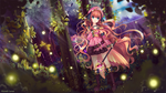
Bright Green or Warm Greens: happiness, growth, money, poison , selfishness, inspiration.

Dark Green: sickness, Friendship, Nature, sickness, poison, sometimes decay.

Please Note, when you are painting a natural background, never use green only, and try to vary your shades of green like the pictures below (Smile)")


COLOUR COMBINATIONS:
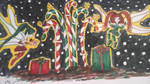
Green and Red: for most of us this immediately screams " Christmas!! ", so in Europe most other meaning has been lost, however as far as I know, this combination mainly sprung from the pagan use of Holly in the solstice. They are complementary colours so, they make each other stand out.

Green and Yellow: when you use gold it can mean money, but otherwise it means sickness and death, colour combo was harder to find than the others:
:thumb581208139:
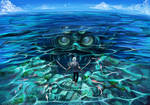
Green and Blue: Has a calming effect, even if your character is holding a weapon:


Green and Purple: can look toxic, insane, unhinged, or like the hulk.


Green and White: Hope, Friendship, money, growth, peace.
:thumb580769954:
Green and Black: Since J.K Rowling's series Harry Potter came out, this also means Slytherin, however it can also mean, envy, healing, decay, poison, sickness, and over running growth. If you're doing vines that surround a witches castle, this is the best choice.


So that's all for this week, if you have something to add that's not on here feel free to comment and please, if you have an idea of what YOU want to know about colour, please let us know!
See ya!
Poison
Sickness
Healing
Hope
Varying degrees of insanity
Nature
Money
Happiness
Friendship
Selfishness
Inspiration
Growth
Life
Love.
A pretty long and complicated list just for one colour! However when you pick a different shades of green you can give different signals in your piece. Green can help bring a sense of balance, harmony, and stability. Unless put with a highly contrasting colour, which then turns the meaning on its head.
Pale green: Freedom, healing, hope, peace, occasionally sickness or insanity.
:thumb611824255:Bright Green or Warm Greens: happiness, growth, money, poison , selfishness, inspiration.
Dark Green: sickness, Friendship, Nature, sickness, poison, sometimes decay.
Please Note, when you are painting a natural background, never use green only, and try to vary your shades of green like the pictures below
COLOUR COMBINATIONS:
Green and Red: for most of us this immediately screams " Christmas!! ", so in Europe most other meaning has been lost, however as far as I know, this combination mainly sprung from the pagan use of Holly in the solstice. They are complementary colours so, they make each other stand out.
Green and Yellow: when you use gold it can mean money, but otherwise it means sickness and death, colour combo was harder to find than the others:
:thumb581208139:
Green and Blue: Has a calming effect, even if your character is holding a weapon:
Green and Purple: can look toxic, insane, unhinged, or like the hulk.
Green and White: Hope, Friendship, money, growth, peace.
:thumb580769954:Green and Black: Since J.K Rowling's series Harry Potter came out, this also means Slytherin, however it can also mean, envy, healing, decay, poison, sickness, and over running growth. If you're doing vines that surround a witches castle, this is the best choice.
So that's all for this week, if you have something to add that's not on here feel free to comment and please, if you have an idea of what YOU want to know about colour, please let us know!
See ya!

List of All Weekly Journals
Hi, to restart the journals in 2018, I'm posting a complete list of all our journals. As some of you know, we've been using this :thumb638719959: as a list, however this should be easier to find. :heart:
Quick List of Sections:
1. Colour Theory Journals
2. 'The Colour:' Journals
3. Generalized Journals (with subsections)
4. Traditional Colouring
5. Digital Colouring
1. Colour Theory Journals
Colour Theory (Journal 15) http://cloud-of-colours.deviantart.com/journal/Weekly-Journal-15-Color-Theory-611976070
Hue, Saturation and Value http://cloud-of-colours.deviantart.com/journal/EDIT-Hue-Saturation-and-Value-Weekly-Jo
Comics, The bare bones : Weekly Journal 48
The Bare Bones of Sequential Panels.
This journal is a little like anatomy, or shading practice, it seems disjointed, but we need these parts to hold our comics together. It gives one a firm starting point, which can then be used to create something else. However, I recommend you look at other sources of information as well.
Terminology:
:bigthumb656085359:
There are a few terms I wish to clarify before I start the main part of the comic. These terms are just from https://en.m.wikipedia.org/wiki/Glossary_of_comics_terminology , though most of them come from Scott McCloud’s books. If you have the pleasure of studying a graphic
Monochromatic Color Scheme- Weekly Journal 47
Greetings everyone~ fizzypopcake (https://www.deviantart.com/fizzypopcake) ~fizzypopcake (https://www.deviantart.com/fizzypopcake) here. This marks as my very first journal entry for this group :D I hope I’ll be able instill some useful info just like how my respectable co-admins did~
:iconleafborderplz::iconleafborderplz::iconleafborderplz::iconleafborderplz::iconleafborderplz::iconleafborderplz::iconleafborderplz::iconleafborderplz::iconleafborderplz::iconleafborderplz:
For this week’s journal, we would be talking about monochromatic color schemes.
Now some would perhaps think that monochrome illustrations would only entail colors of black and white but in actuality, it also in
Spooky Colouring - Weekly Journal 46
I need to start off on a sour note... please do NOT POST ADOPTABLES in unrelated folders. We have an adoptable folder, adoptables go in there that way anyone looking to buy can find you.
ADOPTABLES GO IN THE ADOPTABLE FOLDER. PLEASE~
Right, Ok, Good.
We are about to enter October, well known in present time for spooky happens, sweets, chocolate and Inktober (we have a journal relating to that next week). We are about to see a overwhelming amount of Halloween based art, so let's go over what it takes to make a creepy/horror based image.
1) Lighting-
A running theme with this journal will be avoiding the natural way. So for lighting by defaul
Featured in Groups
© 2016 - 2024 Cloud-Of-Colours
Comments18
Join the community to add your comment. Already a deviant? Log In
![Llama Emoji 27 (Awesome) [V2]](https://orig11.deviantart.net/fdde/f/2013/324/d/1/llama_emoji_27__awesome___v2__by_jerikuto-d6ujubj.gif) Nice drawings!! Red and green will always remember me Christmas xDD
Nice drawings!! Red and green will always remember me Christmas xDD